The BrandBrain design system
Clear thinking.
A connected identity.
One violet thread, from discovering a brand to creating something new. These are the foundations and components that make BrandBrain feel like BrandBrain.

An identity with a little imagination.
The new mark joins the idea of a brain with a compact, connected silhouette. Keep the symbol consistent across the site, workspace, app icon and social preview.
BrandBrainBrandBrainGive it room.
Keep clear space equal to half the mark’s height. Use the wordmark when there is room to introduce the product.
Keep it recognizable.
Use the mark at 24px or larger in interfaces. For smaller browser icons, use the supplied app icon exports.
Use the source.
Keep the original proportions and color. Avoid stretching, filters, extra outlines or rotating the mark.


Violet leads. The content has room.
Paper and white keep the public experience light. Deep violet neutrals give the workspace focus. Use semantic color roles so components adapt together.
#F8F6FC
The light canvas
#FFFFFF
Cards and controls
#251B3B
Primary text
#746882
Supporting text on paper
#8553E5
The signature brand color
#7041C5
Light-theme buttons and links
#EAE2F8
Quiet emphasis
Use Action violet for light-theme buttons and links. Reserve the brighter signature violet for the identity and larger graphic details.
BrandBrainLight themeYour next discovery.
A focused space for every brand you work with.
BrandBrainDark themeYour next discovery.
A focused space for every brand you work with.
A clear voice, at every size.
Geist carries both the identity and the interface. Geist Mono is reserved for code, tokens and exact values. Use sentence case, short labels and comfortable reading widths.
Everything a brand is.
Everything it could be.
Turn a website into a useful brand profile. Bring its identity into your next idea. The typography stays clear so the work can take the lead.
| Role | Size | Weight | Line height | Use |
|---|---|---|---|---|
| Display | 44–88px | 550 | 1.04 | One defining headline per page |
| Heading | 30–48px | 550 | 1.12 | Sections and key statements |
| Title | 20–24px | 600 | 1.3 | Cards, dialogs and content groups |
| Body | 16px | 400 | 1.75 | Explanations and reading |
| Interface | 14px | 400 / 500 | 1.5 | Labels, actions and dense views |
| Caption | 12px | 400 / 500 | 1.5 | Supporting details |
Room to think. Structure to follow.
Build from a 4px rhythm. Keep related elements close, separate decisions with space, and use rounded shapes to distinguish controls, cards and larger panels.
Control · 10px
Inputs and buttons
Card · 20px
A single group of content
Panel · 28px
A larger working area
Use 20–40px page gutters, up to 1240px of working width, and roughly 65 characters per line for body copy. Small shadows lift overlays; ordinary content relies on spacing and borders.
One family. One consistent stroke.
Lucide icons use a 1.65px stroke with rounded ends. Keep icons literal: search for discovery, a palette for colors, a workflow for flows. The brand mark always remains its own asset.
Decorative icons stay hidden from screen readers. Give every icon-only button a clear accessible name and a generous hit area.
Every action has a hierarchy.
Use one primary action per decision. Secondary actions share the violet family; outline and ghost styles let less important options recede. These examples respond without changing any data.
Choose a button to preview its feedback.
Useful feedback is part of the interface.
Labels stay visible. Help text explains what is needed, and validation explains how to recover. Status colors are always paired with words or icons.
Review your references.
The website could not be reached.
Focus is part of the design.
Familiar parts. Flexible patterns.
Compose the shared primitives for brand profiles, creative workflows and their states. Cards group related content; tabs organize sibling views; an empty state gives the next step.
A place for your next discovery.
Start with a brand. Its logos, colors and details give the next project a useful starting point.
Explore the libraryKeep a brand’s logo, palette and typography together. The active tab uses violet to show where you are.
Movement follows intent.
Use 140–220ms for hover, focus and state changes. Keep recurring animation to meaningful progress, and respect reduced-motion preferences.
Write the next step.
Use specific actions such as “Discover a brand” and “Open canvas.” Explain errors plainly, and avoid invented metrics or vague promises.
Imagination, grounded in the product.
Our artwork makes brand intelligence tangible: sculptural forms, a violet brain, and the practical tools of identity. Use it at moments of introduction, with breathing room around real product content.
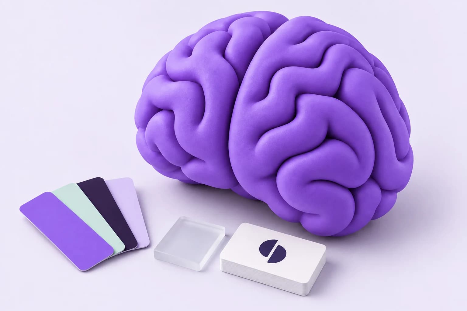
Artwork is illustrative. Keep interface text in HTML, preserve the artwork’s proportions, and use the supplied optimized WebP for the web. Do not place essential information inside an image.